
Live notebook
You can run this notebook in a live session ![]() or view it on Github.
or view it on Github.
Feature maps#
In this tutorial we will extract qualitative information from pattern intensities, called feature maps (for lack of a better description).
These maps be useful when interpreting indexing results, as they are indexing independent, and also to assert the pattern quality and similarity.
Let us import the necessary libraries and a small nickel EBSD test dataset of 75 x 55 patterns
[1]:
# Exchange inline for notebook or qt5 (from pyqt) for interactive plotting
%matplotlib inline

import matplotlib.pyplot as plt
import numpy as np

import hyperspy.api as hs
import kikuchipy as kp

# Use kp.load("data.h5") to load your own data
s = kp.data.nickel_ebsd_large(allow_download=True)  # External download
s
[1]:
<EBSD, title: patterns Scan 1, dimensions: (75, 55|60, 60)>
Image quality#
The image quality metric \(Q\) presented by Krieger Lassen [Lassen, 1994] can be calculated for an EBSD signal with get_image_quality(), or, for a single pattern (numpy.ndarray), with get_image_quality(). Following the notation in [Marquardt et al., 2017], it is given by
The function \(w(h, k)\) is the Fast Fourier Transform (FFT) power spectrum of the EBSD pattern, and the vectors \(\mathbf{q}\) are the frequency vectors with components \((h, k)\). The sharper the Kikuchi bands, the greater the high frequency content of the power spectrum, and thus the closer \(Q\) will be to unity.
Since we want to use the image quality metric to determine how pronounced the Kikuchi bands in our patterns are, we first remove the static and dynamic background
[2]:
s.remove_static_background()
s.remove_dynamic_background()
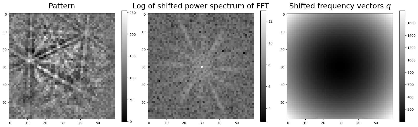
To visualize parts of the computation, we compute the power spectrum of a pattern in the Nickel EBSD data set and the frequency vectors, shift the zero-frequency components to the centre, and plot them
[3]:
p = s.inav[20, 11].data
p_fft = kp.pattern.fft(p, shift=True)
q = kp.pattern.fft_frequency_vectors(shape=p.shape)

fig, ax = plt.subplots(figsize=(22, 6), ncols=3)
title_kwargs = dict(fontsize=22, pad=15)
fig.subplots_adjust(wspace=0.05)

im0 = ax[0].imshow(p, cmap="gray")
ax[0].set_title("Pattern", **title_kwargs)
fig.colorbar(im0, ax=ax[0])

im1 = ax[1].imshow(np.log(kp.pattern.fft_spectrum(p_fft)), cmap="gray")
ax[1].set_title("Log of shifted power spectrum of FFT", **title_kwargs)
fig.colorbar(im1, ax=ax[1])

im2 = ax[2].imshow(np.fft.fftshift(q), cmap="gray")
ax[2].set_title(r"Shifted frequency vectors $q$", **title_kwargs)
_ = fig.colorbar(im2, ax=ax[2])
If we don’t want the EBSD patterns to be zero-mean normalized before computing \(Q\), we must pass get_image_quality(normalize=False).
Let’s compute the image quality \(Q\) and plot it for the entire data set (using the CrystalMap.plot() method of the EBSD.xmap attribute)
[4]:
iq = s.get_image_quality(normalize=True) # Default
[5]:
s.xmap.plot(
    iq.ravel(),
    cmap="gray",
    colorbar=True,
    colorbar_label="Image quality, $Q$",
    remove_padding=True,
)
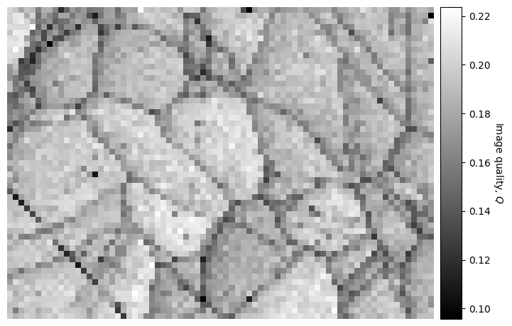
If we want to use this map to navigate around in when plotting patterns, we can easily do that as explained in the visualizing patterns tutorial.
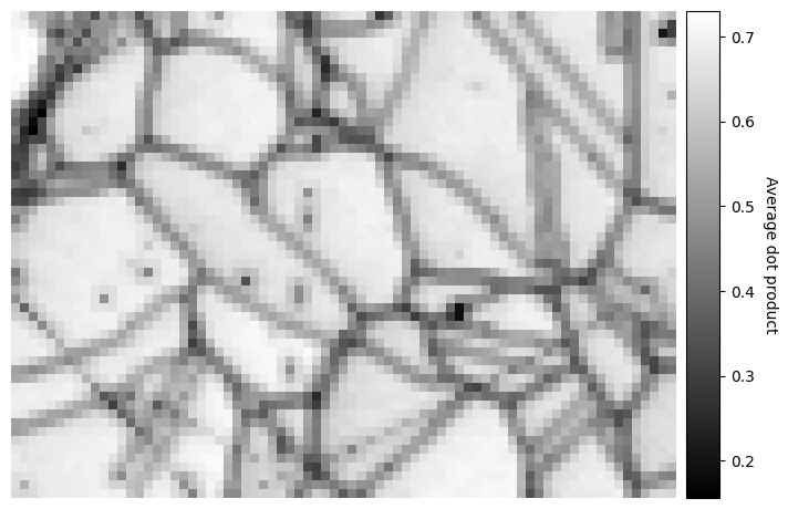
Average dot product#
The average dot product, or normalized cross-correlation when centering each pattern’s intensity about zero and normalizing the intensities to a standard deviation \(\sigma\) of 1 (which is the default behaviour), between each pattern and their four nearest neighbours, can be obtained for an EBSD signal with get_average_neighbour_dot_product_map()
[6]:
adp = s.get_average_neighbour_dot_product_map()
[########################################] | 100% Completed | 403.16 ms
[7]:
s.xmap.plot(
    adp.ravel(),
    cmap="gray",
    colorbar=True,
    colorbar_label="Average dot product",
    remove_padding=True,
)
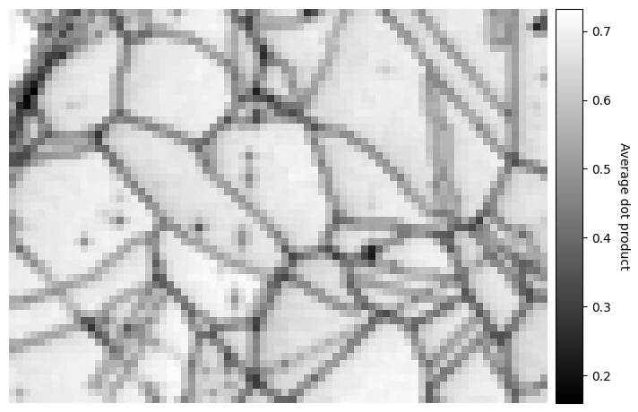
The map displays how similar each pattern is to its neighbours. Grain boundaries, and some scratches on the sample, can be clearly seen as pixels with a lower value, signifying that they are more dissimilar to their neighbouring pixels, as the ones within grains where the neighbour pixel similarity is high.
The map above was created by averaging the dot product matrix per map point, created by calculating the dot product between each pattern and their four nearest neighbours, which can be seen in the black spots (uneven sample surface) in the left grains
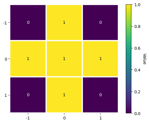
[8]:
w1 = kp.filters.Window()
w1.plot()
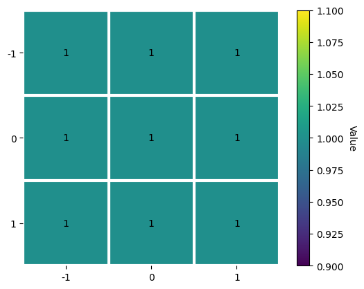
We could instead average with e.g. the eight nearest neighbours
[9]:
w2 = kp.filters.Window(window="rectangular", shape=(3, 3))
w2.plot()
[10]:
adp2 = s.get_average_neighbour_dot_product_map(window=w2)

s.xmap.plot(
    adp2.ravel(),
    cmap="gray",
    colorbar=True,
    colorbar_label="Average dot product",
    remove_padding=True,
)
[########################################] | 100% Completed | 504.94 ms
Note that the window coefficients must be integers.
We can also control whether pattern intensities should be centered about zero and/or whether they should be normalized prior to calculating the dot products by passing zero_mean=False and/or normalize=False. These are True by default. The data type of the output map, 32-bit floating point by default, can be set by passing e.g. dtype_out=np.float64.
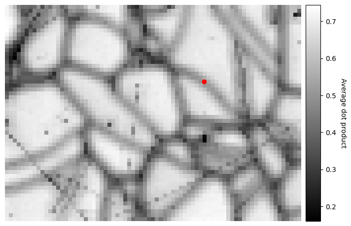
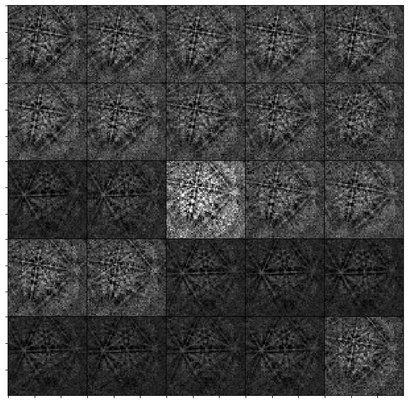
We can obtain the dot product matrices per map point, that is the matrices before they are averaged, with get_neighbour_dot_product_matrices(). Let’s see similar a pattern on a grain boundary in map point (x, y) = (50, 19) is to all its nearest neighbour in a (5, 5) window centered on that point
[11]:
w3 = kp.filters.Window("rectangular", shape=(5, 5))
dp_matrices = s.get_neighbour_dot_product_matrices(window=w3)
[########################################] | 100% Completed | 907.36 ms
[12]:
x, y = (50, 19)
s_dp_matrices = hs.signals.Signal2D(dp_matrices)
s_dp_matrices.inav[x, y].plot()
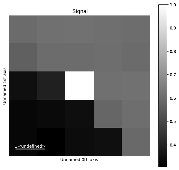
We can see that the pattern is more similar to the patterns up to the right, while it is quite dissimilar to the patterns to the lower left. Let’s visualize this more clearly, as is done e.g. in Fig. 1 by [Brewick et al., 2019]
[13]:
y_n, x_n = w3.n_neighbours

s2 = s.inav[x - x_n : x + x_n + 1, y - y_n : y + y_n + 1].deepcopy()
s2.rescale_intensity(percentiles=(0.5, 99.5))  # Stretch the contrast a bit

# Signals must have same navigation shape (warning can be ignored)
s3 = s2 * s_dp_matrices.inav[x, y].T
WARNING | Hyperspy | Axis calibration mismatch detected along axis 0. The calibration of signal 0 along this axis will be applied to all signals after stacking. (hyperspy.misc._signal_tools:110)
WARNING | Hyperspy | Axis calibration mismatch detected along axis 1. The calibration of signal 0 along this axis will be applied to all signals after stacking. (hyperspy.misc._signal_tools:110)
[14]:
_ = hs.plot.plot_images(
    images=s3,
    per_row=5,
    label=None,
    suptitle=None,
    axes_decor=None,
    colorbar=None,
    vmin=int(s3.data.min()),
    vmax=int(s3.data.max()),
    padding=dict(wspace=0, hspace=-0.05),
    fig=plt.figure(figsize=(10, 10)),
)
Finally, we can pass this dot product matrix directly to get_average_neighbour_dot_product_map() via the dp_matrices parameter to obtain the average dot product map from these matrices
[15]:
adp3 = s.get_average_neighbour_dot_product_map(dp_matrices=dp_matrices)
Let’s plot this and highlight the location of the pattern on the grain boundary above with a red circle
[16]:
fig = s.xmap.plot(
    adp3.ravel(),
    cmap="gray",
    colorbar=True,
    colorbar_label="Average dot product",
    remove_padding=True,
    return_figure=True,
)
fig.axes[0].scatter(x, y, c="r");